Landsat letter H
Southwestern Kyrgyzstan H: Mountain Structure as a Letter
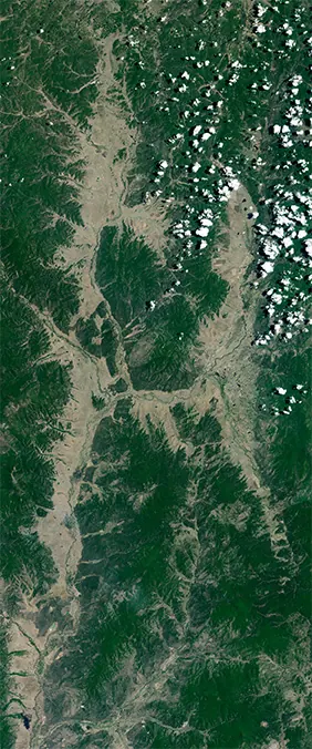
See how ridges and valleys in southwestern Kyrgyzstan form an H-shaped Landsat letter tile.

Quick answer
The Southwestern Kyrgyzstan H tile works because parallel landforms and a crossing valley create two upright strokes joined by a middle bar. It gives the Landsat name generator a readable H with place context, coordinates, and a linked source reference, so a generated name can use a real Earth scene instead of a drawn alphabet shape.
Quick facts
- Letter
- H
- Tile
- Southwestern Kyrgyzstan
- Coordinates
- 40°14'03.6 N 71°14'22.8 E
- Best use
- Use this H when a name benefits from a strong central letter with an angular, highland character
- Image reading
- Check whether both upright strokes remain distinct, then use the middle crossing feature as the cue that locks the scene into H
Use this Landsat letter
Continue from this article to the name generator, the matching letter page, or the full A-Z satellite letter gallery.
Source links
Open the original NASA, USGS, or public source reference used for this satellite-letter story.
Map links
Open the map location for this tile to inspect its coordinates separately from source references.
Why Southwestern Kyrgyzstan reads as H
Southwestern Kyrgyzstan works as a Landsat H tile because parallel landforms and a crossing valley create two upright strokes joined by a middle bar. At the crop used by the generator, the shape is legible before the viewer has to know the geography, which is the first test for any satellite alphabet image.
The scene still stays anchored in place. The coordinates 40°14'03.6 N 71°14'22.8 E and the linked source reference let a reader move from the letter impression to the actual landscape, so the tile is more than a decorative graphic.
That balance is why this page treats the image as a place story and a name-generator asset. The letter is useful on its own, but it becomes more meaningful when a visitor can open the letter page and compare it with neighboring variants.
What the landscape contributes
The mountain setting gives the H a rugged texture, with relief and dry terrain replacing the smooth stroke of a font. This context matters because Landsat name letters should still look like Earth after they look like alphabet characters.
A strong tile has to do two jobs at once. It needs enough contrast for the letter to be read quickly, and it needs enough texture for the viewer to understand that the shape comes from satellite imagery rather than a normal font.
In this case, the H shape is not artificially drawn over the image. The generator uses the existing scene as the letterform, preserving the irregular edges, colors, and spatial clues that make the tile feel tied to a real location.
Using this H in a generated name
Use this H when a name benefits from a strong central letter with an angular, highland character. The best results usually come from checking the full name, not just the single letter, because neighboring tiles change how readable the composition feels.
Open the generator, type a name that contains H, and click the H tile to cycle available variants. If this Southwestern Kyrgyzstan version appears, compare its color, weight, and shape against the surrounding letters before downloading or sharing the image.
This workflow keeps the article connected to action. A reader can learn the story, try the tile in a real name, then return to the A-Z gallery if another H option fits the composition better.
How this H compares with other options
Compared with the Khorinsky District H, the Kyrgyzstan tile has clearer structural contrast and a more dramatic terrain story. That comparison is useful because repeated letters should not always use the same scene, especially in names where the same character appears more than once.
The H letter page collects every checked-in variant for this character. Some variants are clearer, some have stronger color, and some are better for long names where the tile has to stay readable at a smaller size.
For search and user experience, this article fills the gap between a quick gallery card and the full generator. It explains why this particular H tile deserves attention without pretending it is the only correct choice.
What to notice in the image
Check whether both upright strokes remain distinct, then use the middle crossing feature as the cue that locks the scene into H. This extra reading step is useful because a Landsat letter has to survive several viewing sizes: the article hero, the generator preview, a downloaded image, and a small shared thumbnail.
Look at the tile once as a letter and once as geography. As a letter, ask whether the stroke order is obvious. As geography, ask which features create the contrast: water, ice, vegetation, sediment, urban edges, field boundaries, rock, or shoreline.
That habit makes the image stronger for users and for search. The page is not simply saying that Southwestern Kyrgyzstan looks like H; it shows how to verify the shape and how to decide whether it belongs in a particular name composition.
Why the place story matters
Southwestern Kyrgyzstan gives the article a tectonic highland context, so the letter can be read through ridge alignment and dry valley structure. That context gives the article a reason to exist beyond listing the tile in the gallery.
A thin article would stop after naming the letter. A stronger article explains why this place creates the shape, what visual evidence to inspect, and how the tile behaves when it is placed next to other Landsat letters.
This is also the reason the page links outward to a source reference and inward to the generator, the letter page, and the A-Z gallery. The reader can move from story to source to action without losing the thread.
Source context and responsible use
Because Southwestern Kyrgyzstan is a real place, the article includes coordinates and a source reference rather than presenting the tile as a generic design asset. That context helps visitors inspect the source location and understand the origin of the letter shape.
This site is an independent NASA-style Landsat name project. It is inspired by public Earth observation imagery and the familiar alphabet idea, but it does not imply endorsement by NASA, USGS, or any other source provider.
When sharing a downloaded name image, the clearest description is that it was made with Landsat-style satellite letter tiles. That keeps the focus on the creative use while preserving the connection to real geography.
Frequently asked questions
Why does Southwestern Kyrgyzstan look like the letter H?+
It reads as H because parallel landforms and a crossing valley create two upright strokes joined by a middle bar, making the letter shape visible in the cropped satellite tile.
Can I use the Southwestern Kyrgyzstan H tile in my own Landsat name?+
Yes. Type a name that includes H in the generator, then click the H tile to cycle variants until this Southwestern Kyrgyzstan image appears.
Where can I compare other H tiles?+
Open the H letter page or the A-Z gallery to compare available H variants, coordinates, map links, and source references.
What should I check before choosing this H tile?+
Check the letter at full-name size, compare it with neighboring tiles, and use the source reference if you want to understand the real landscape behind the shape.
Related Landsat name resources
Read next
Landsat name letters
Landsat Name Letters Guide: How to Spell Your Name from A to Z
A practical guide to using Landsat name letters, switching tile variants, downloading images, and sharing generated names.
how Landsat works
How Landsat Works: The Satellite Program Behind Name Letters
Learn how Landsat satellites observe Earth and why their long-running imagery makes Your Name in Landsat possible.